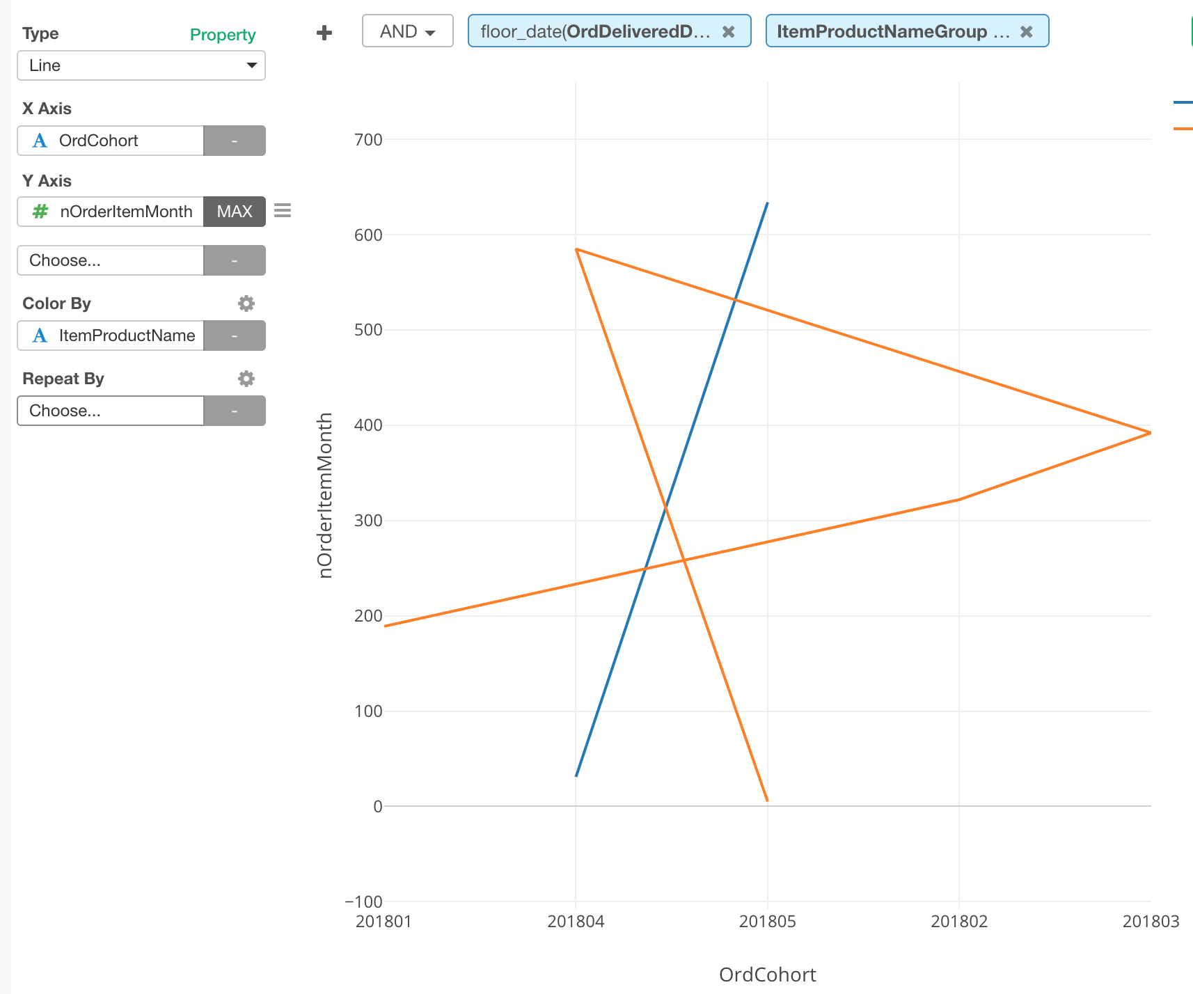
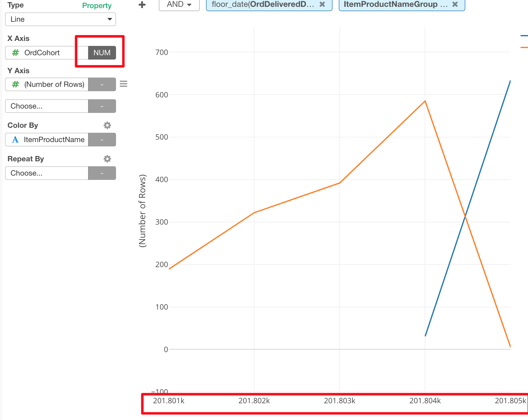
When the X-axis is a ‘text’ is a categorical one (in my case is the cohort with values like 201801, 201802 …) and the ‘color by’ is used, the X-axis is ordered in a wrong way :
We have fixed a couple of chart axis related issues in 4.4, the latest release which is available from https://exploratory.io/download
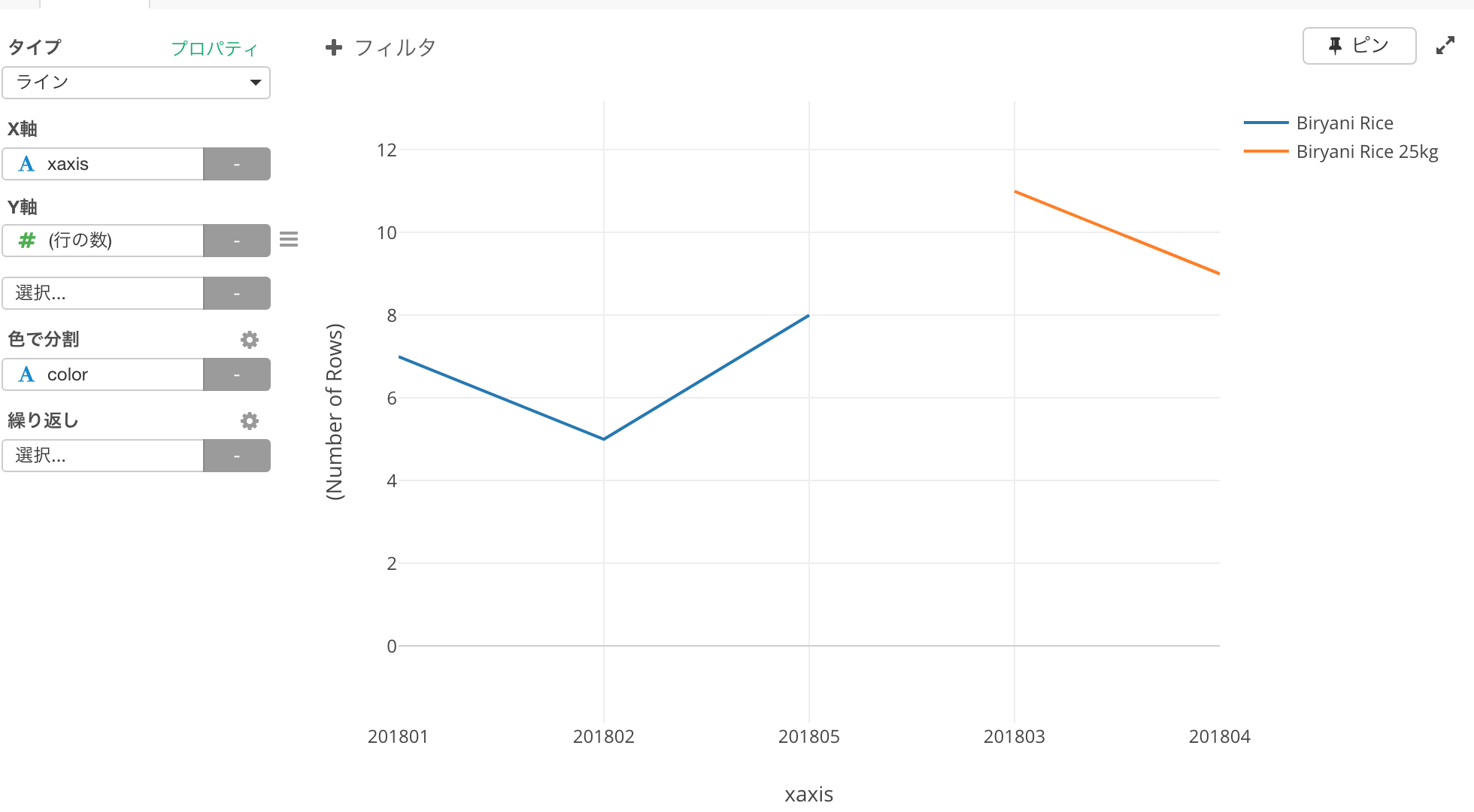
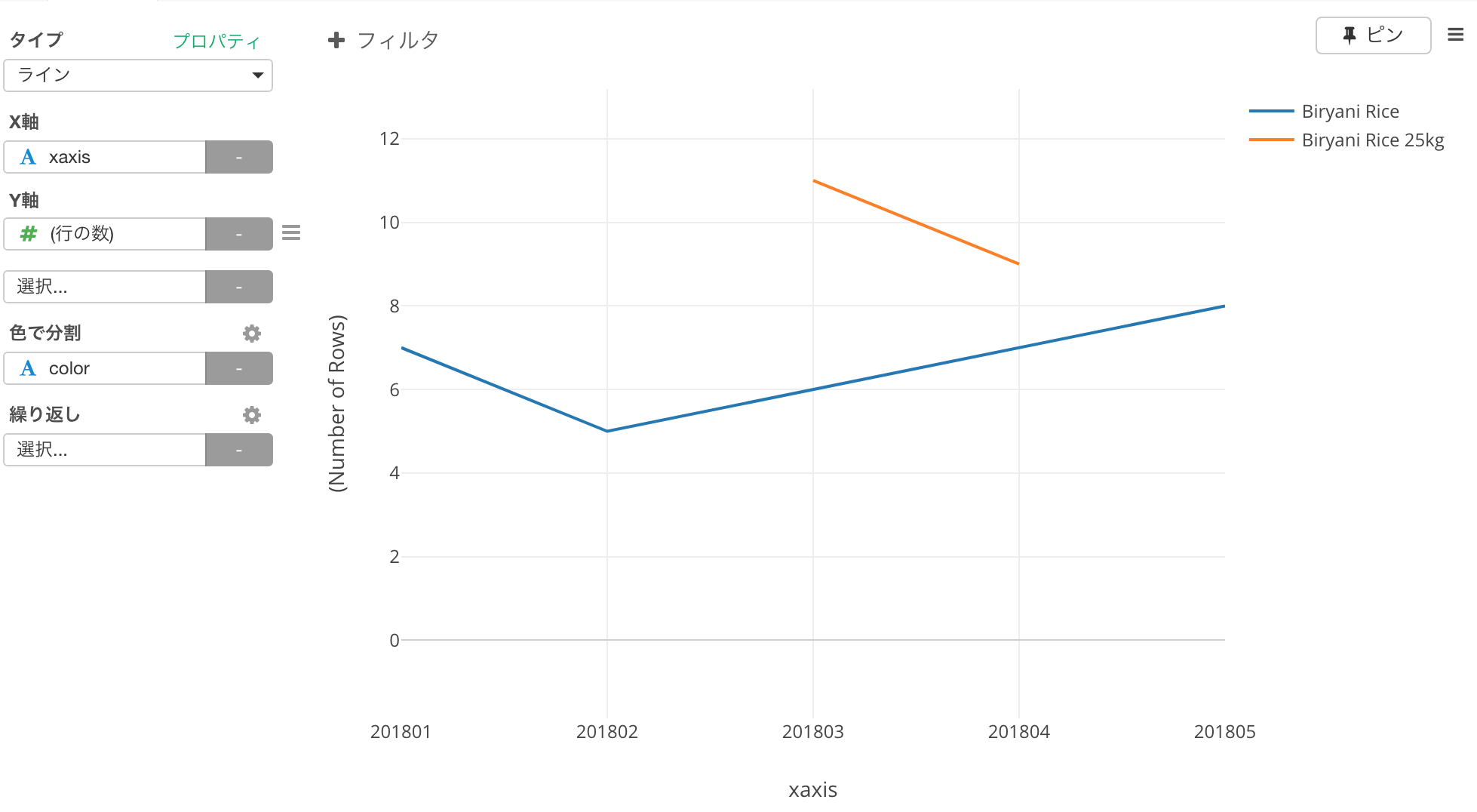
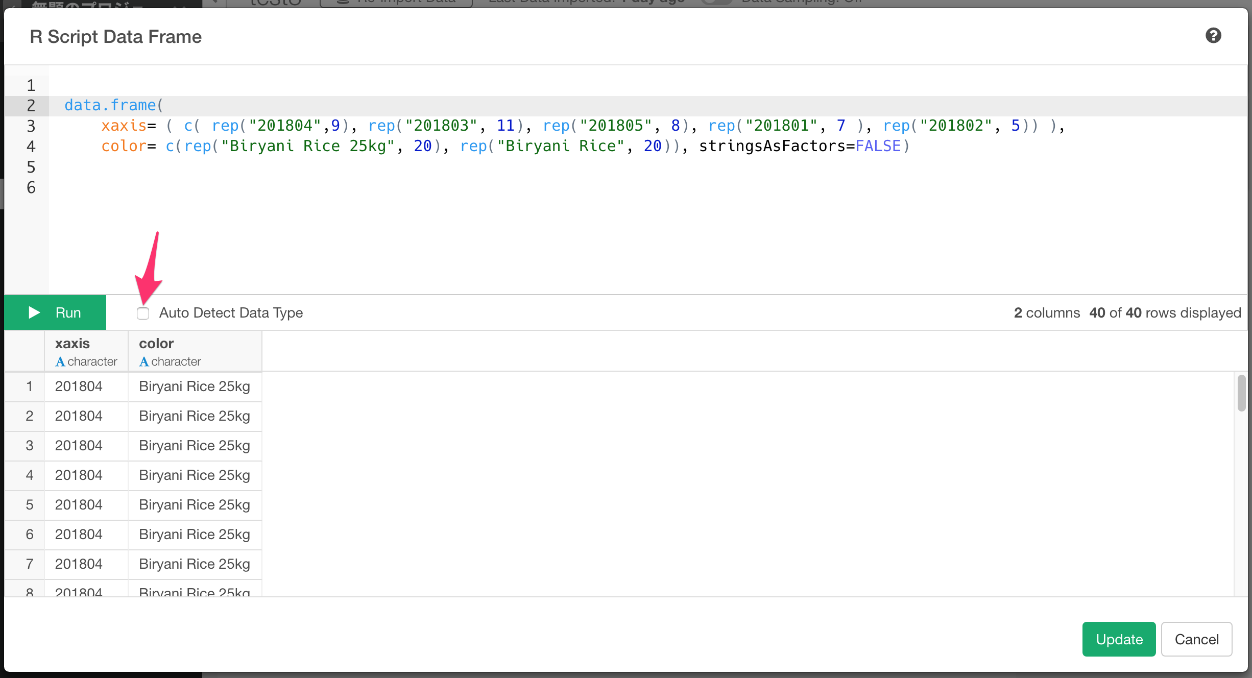
I created a simple test case with R script data source to reproduce the issue. Here are the output of 4.3 and 4.4. As you can see, the X axis is ordered correctly on 4.4. So, please try 4.4. Hope your issue is also fixed.