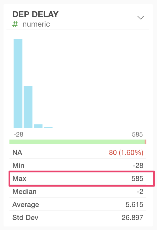
In some cases, the min/max values in the Summary View and Violin chart don’t match.
There are 2 reasons for this mismatch.
-
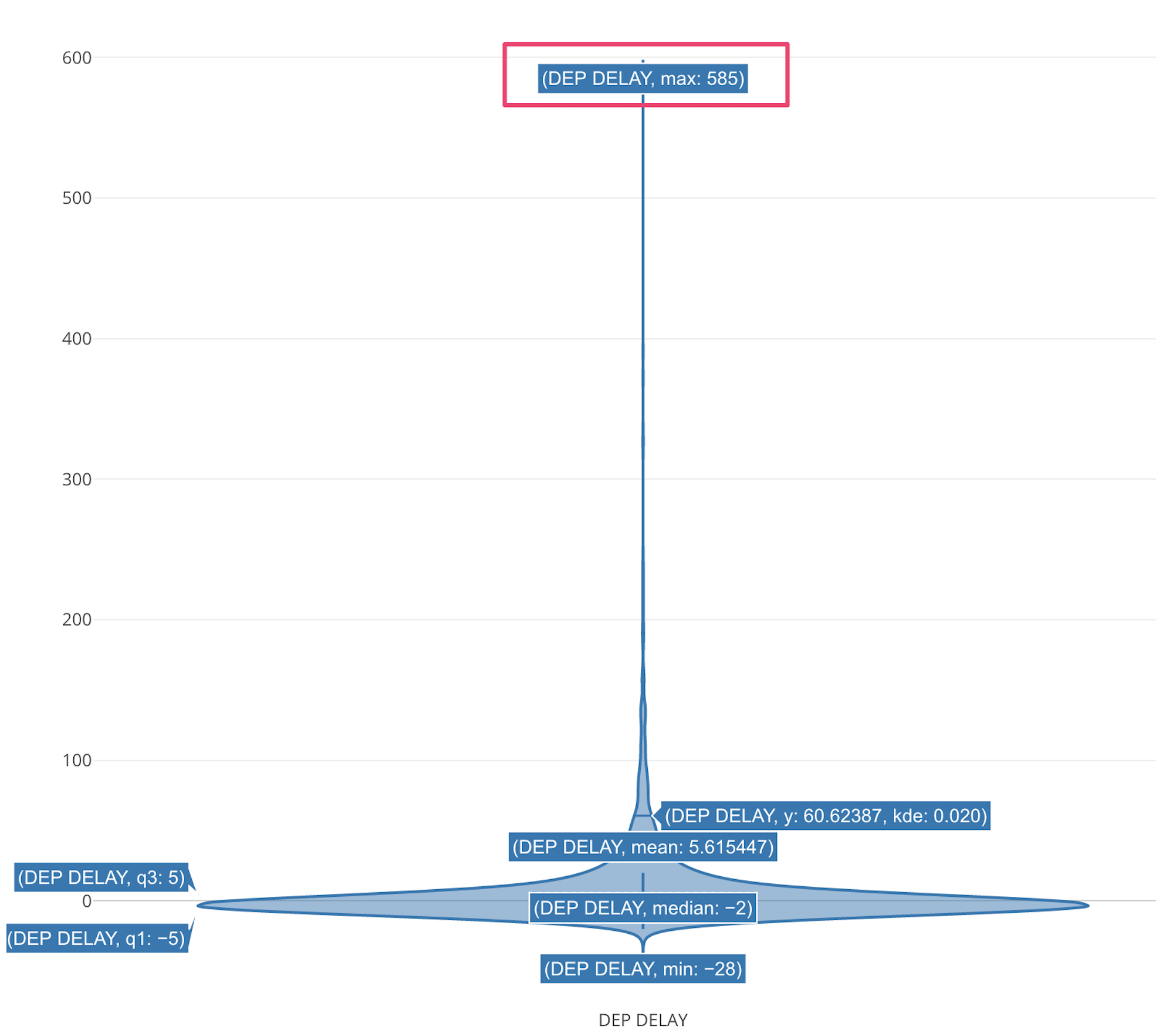
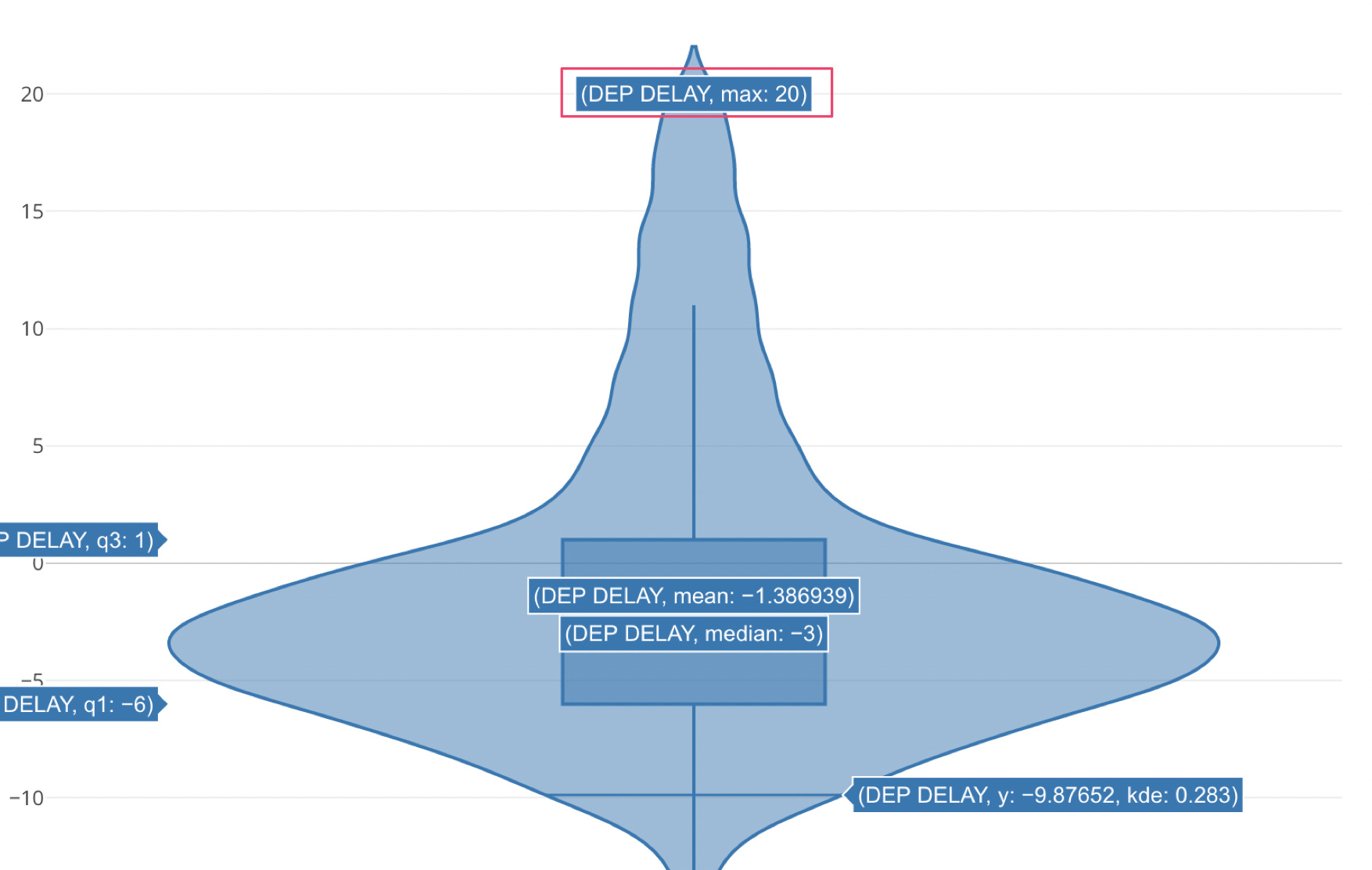
By default, the Violin chart excludes the outliers from the data before drawing. That makes the data range narrower. If you want to include outliers, check the “Include Outlier” checbox at Y axis.
-
If the number of rows of the original data exceeds the sampling threshold, the Violin chart samples the data before drawing. That makes the data range narrower too. If you see "Sample Size: " at the top of the chart, it means the sampling is done.

There are 2 ways to avoid the data sampling.
-
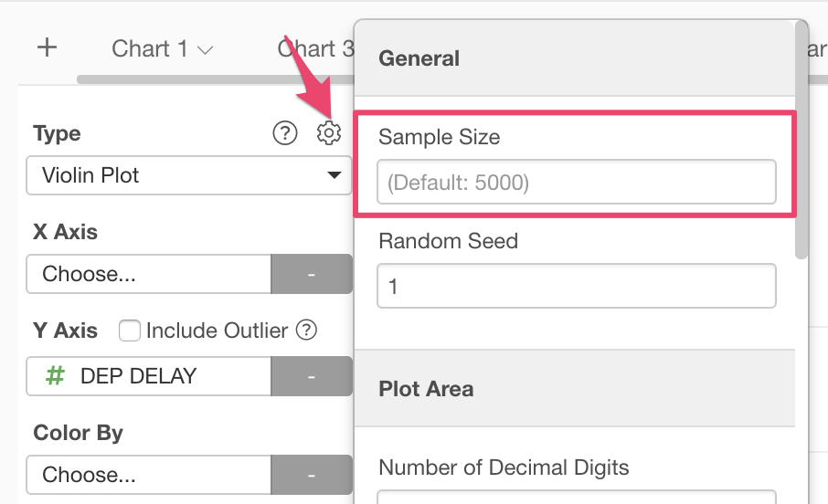
Raise the default sample size in the chart. You can change the default sample size from the chart property dialog. Note that the chart may take longer time to draw if you set larger sample size.
-
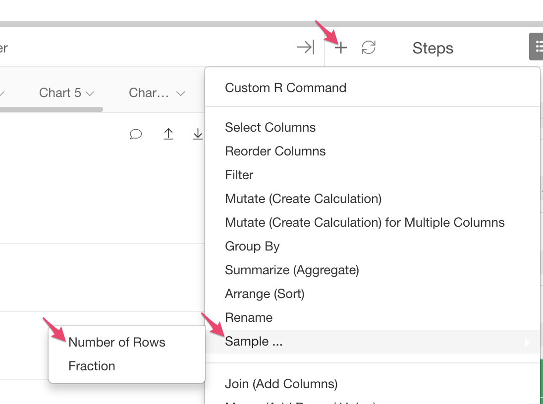
Sample the original data to reduce the number of rows. You can sample the data from the “Sample” menu from the Step menu.
Once you resolve those things above, the Violin chart will show the same numbers as shown in the Summary View.