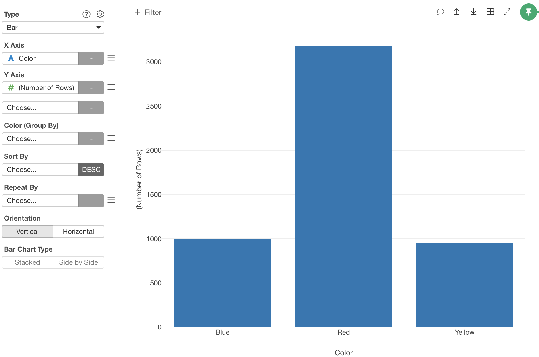
Suppose you have car sales data. Each row represents a car sold. Now you want to show the percentage of the number of cars sold per car color. Here is how.
Select the “Color” column at X axis. It shows bars. Each bar represents a number of rows for each color.
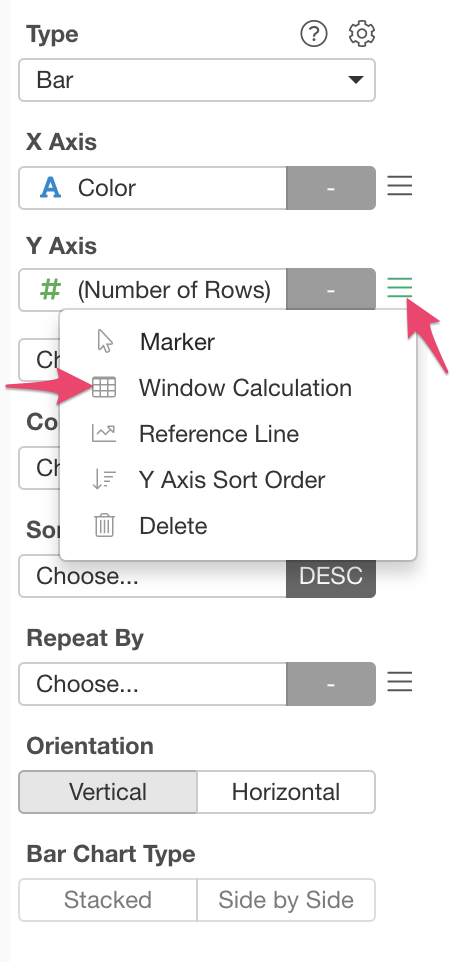
Choose “Window Function” from the Y axis menu.
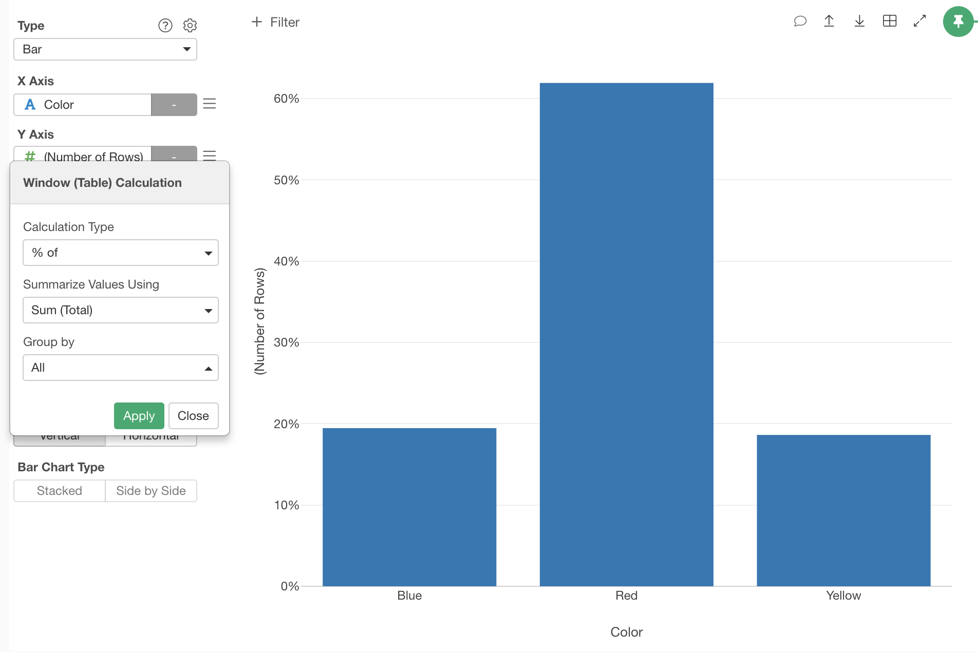
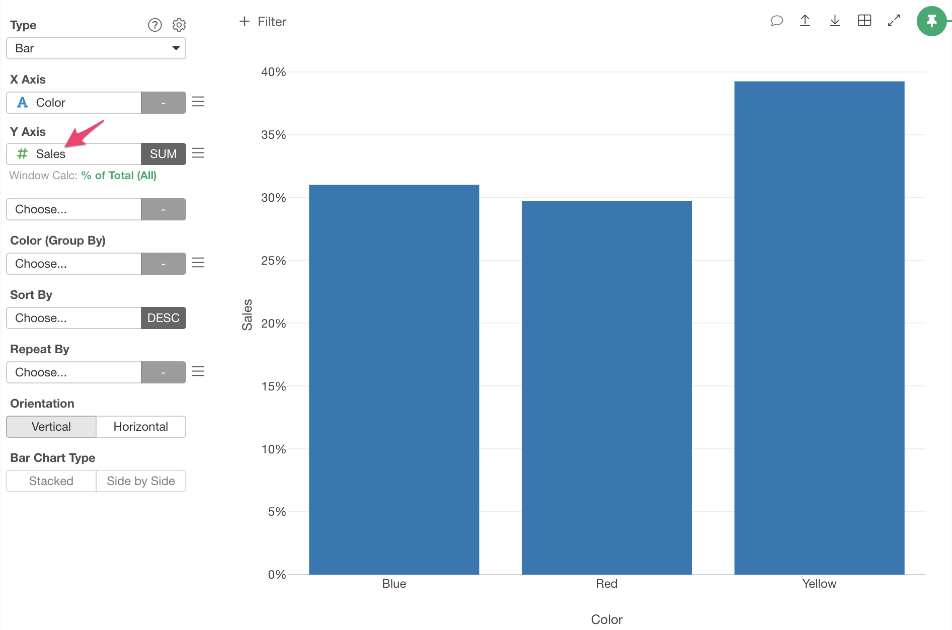
Choose “% of” Calculation Type, “All” for Group By and click “Apply” button. Now it shows the percentage of the number of cars sold for each car color.
You can do not only for the number of rows but also for other values. For example, if you have sales amount data in Sales column, you can assign the column to Y Axis.
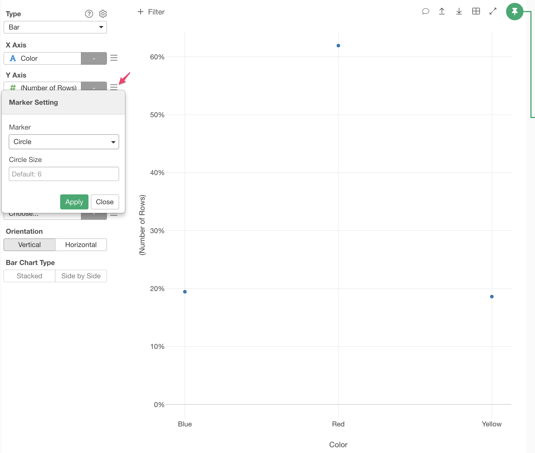
You can change the marker to “Circle” to make it like a scatter chart from the Marker setting at the Y Axis menu.