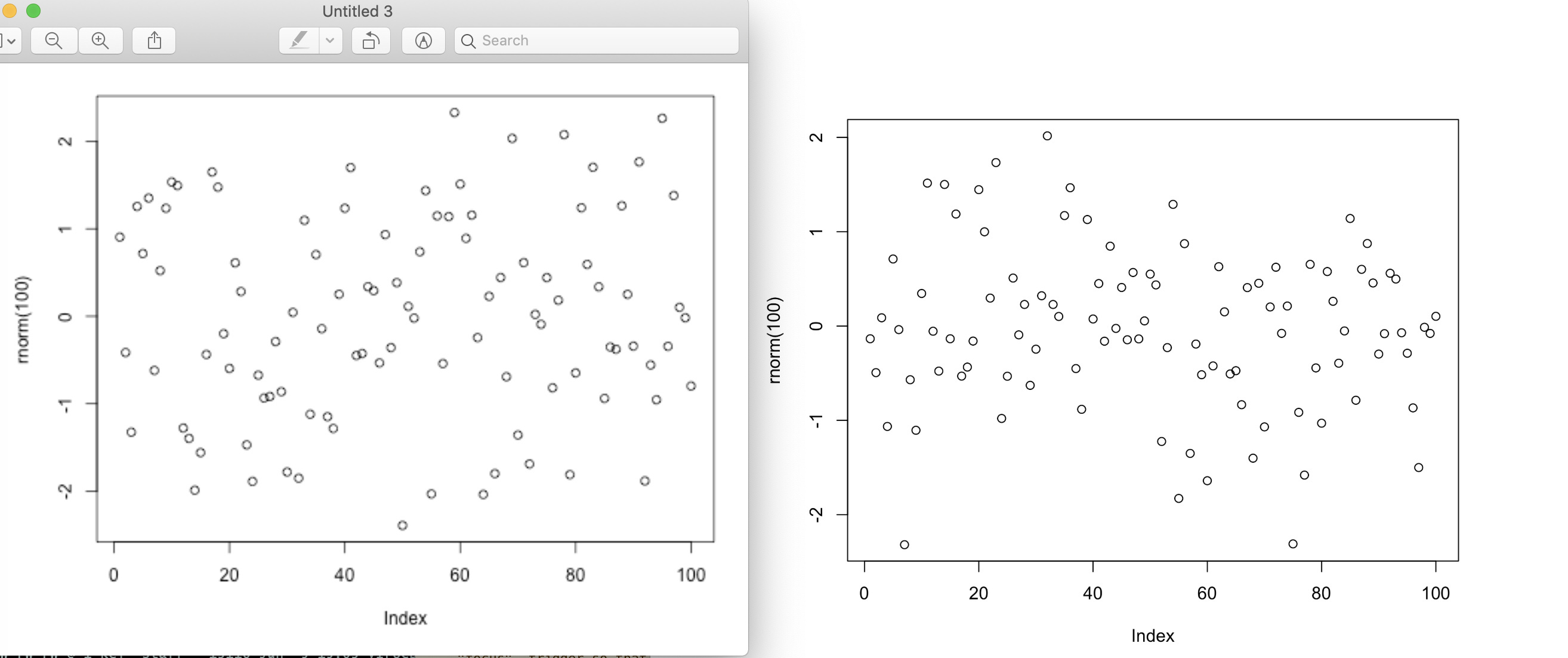
If you see a blurred output (such as charts) from R in your Note or Slides, you can specify the “dpi” parameter to get the crisp output. You can try “dpi=300” first, then adjust it. A code example is here.
```{r dpi=300, fig.width=7, fig.height=6}
plot(rnorm(100))
```
Here is the output example. The left one is without the “dpi” parameter, the right one with “dpi=300”.