Suppose you have sales data from January 2023 to January 2025, with each row representing sales for a particular month, as shown below:
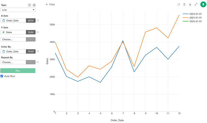
Using this data, you created a chart to visualize monthly sales for each year, like this:
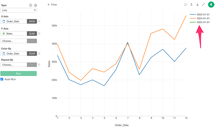
When displaying the chart this way, you may notice that although there are sales for January 2025, nothing appears on the chart:
This happens because there is only one month of data for 2025. With just a single data point, nothing is displayed on the line chart by default.
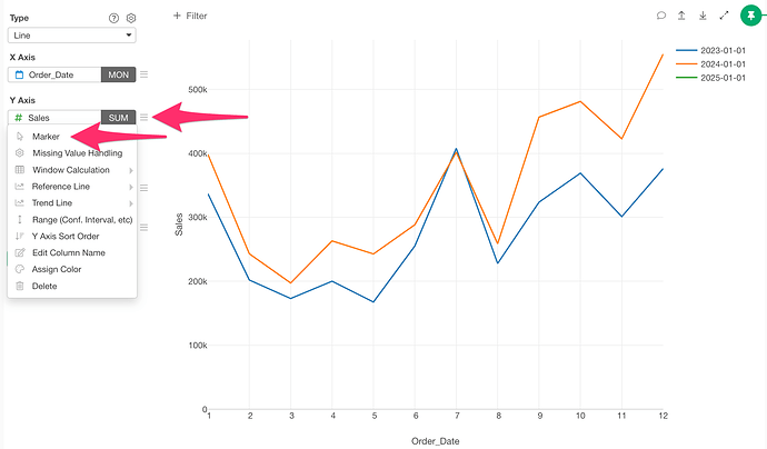
In such cases, go to the Y-axis menu and select Marker:
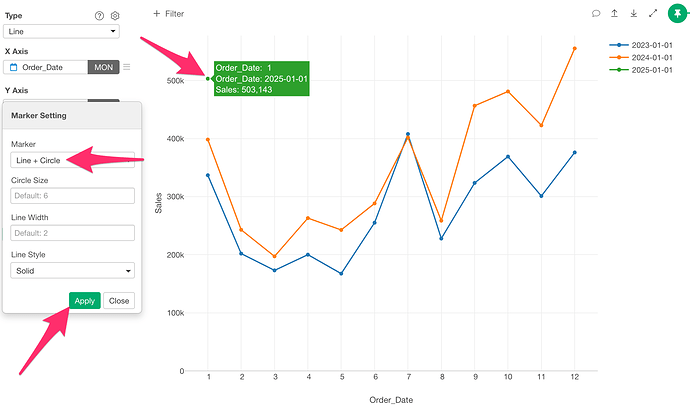
Set the marker option to Line + Circle and apply the change. This will display each data point as a circle, allowing you to see the data even when there is only one data point.

