These ‘Actual (Mean)’ values are literally the means of the actual data. That’s how it would look if you visualize the actual data under the Chart.
For example, in the following case of the first chart (left hand side top), if you assign ARR_DELAY column to X-Axis and DEP_DELAY to Y-Axis with Line chart under Chart view you’ll see a chart with the gray line (Actual Mean).
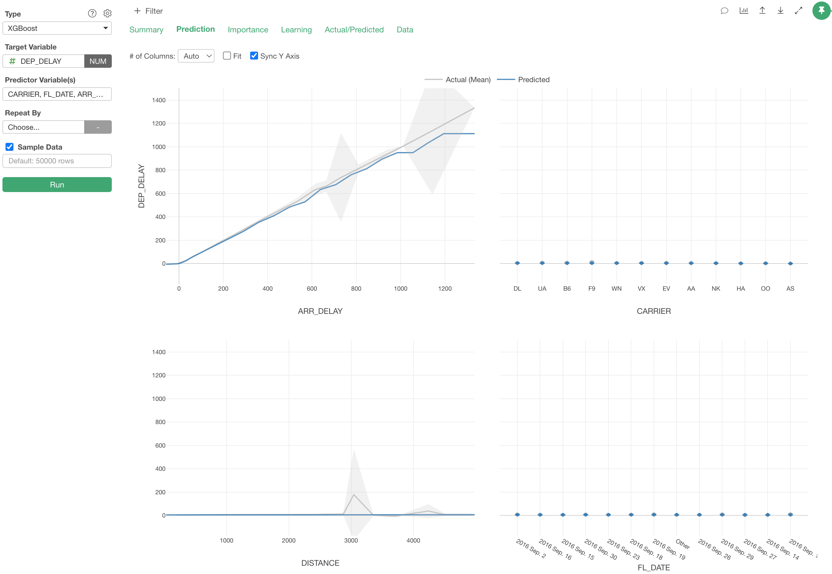
Two things to note.
- When the predictor variable is Numeric data type, it creates 20 buckets with equal width and calculate the means for each bucket, then connects those values with the gray line.
- It shows not only the mean values but also the confidence interval. So the predictor variable is Character data type then it would be more like Error Bar chart rather than Bar/Line charts.